
UNIT ONE
OVERVIEW
In this unit, I will learn about the fundamental skills and theories of the design and marketing industry. It will teach us how to use both software and hardware effectively. For example, we will learn about how to use all of the different Photoshop tools and learn about all of the best websites for the industry. This will also be my introduction into this field of work so it will teach me the do's and don't of digital design and how to be the most effective designer for the course and for the future. Unit one will teach soft skills such as communication, which will not only be very important in the course but also it is a very valued skill in life as good communication between people makes everything go easier and smoother.
COLOUR THEORY
- What is colour theory including historical information?
Colour theory is the study of how colours interact and affect one another, as well as how they influence human emotions and perceptions. It provides a framework for understanding colour relationships and is often used in art, design, and various creative fields.
- Where is colour theory used e.g. adverts, packaging etc.?
Colour theory is used in advertising, fashion, design, branding and much more. This is because colours are strategically chosen to capture a persons attention and stimulate a certain emotion within someone. This means if the company want their appearance to make customers feel happy then they would use a warm colour scheme, for example.
- Why is colour theory an essential theory for designers to understand?
Colour theory is essential for designers to understand as certain colours can make people more likely to be interested in a product. This is because colours are associated with different emotions; therefore if a product is meant to make feel happy but is designed with a cold colour scheme people are less likely to be interested in it.
- The meaning of colours; what does each colour represent; aim to include a supportive image with this that backs up your understanding.
Red- Passion, love, excitement, courage.
Blue- Calmness, serenity, trust, wisdom
Green- Nature, growth, balance, sustainability
Yellow- Joy, kindness, enthusiasm, cheerfulness
Black- Power, authority, grief, sophistication
White- Purity, cleanliness, innocence, neutrality
Purple-Royalty, creativity, imagination, spirituality
Pink- Femininity, affection, youthfulness, peace
Orange-Warmth, adventure, exploration, caution
- What are warm and cool colours; show examples?
Warm colours are colours that are typically associated energy, warmth and enthusiasm. These are colours such as red, orange, yellow and green . Cold colours are colours that are associated with calmness, tranquility and serenity. These are colours such as dark green, blue, dark blue and purple.
- What are hex codes and why is it important to use them?
Hex codes are a way to represent colours in digital design and web development. A hex code is a six-digit code that starts with a hashtag and is followed by a combination of numbers and letters. It is based on the RGB (red, green, blue) colour model, where each pair of digits represents the intensity of red, green, and blue in a colour. it is important to use them as it ensures you keep the same colour throughout your whole project, this adds professionalism to the company.
- What is the colour scheme generator; share examples
A colour scheme generation is something that creates different colour schemes with hex codes so that you can include them in a project.
ABOUT ME MOODBOARD

BRUSHEEZY AND DAFONT
Brusheezy is website which allows people to download lots of different brushes for free. Brushes can be used to create lots of different shapes and effects onto a design. This is important in helping making designs stand out and look more visually appealing. Furthermore, it also makes creating designs much simpler as it gives you a pre-made brushes so within a few clicks you can very easily create the effect which you are looking for. Furthermore, brushes also allow you to add layering and depth to a design and make something look more three dimensional, which helps in building interest in a design and making it look more professional and real. On the other hand, Dafont allows you to add lots of different fonts to your work. Fonts are important in design for conveying different emotions and feelings and providing further creative design elements within a project. Text fonts can be used in many different way of many different lengths of text so it is important that you get the correct font for what you are writing. For example, a bold and thick font would be better for a title rather than a block of text as bold texts stand out and in big clumps of text become hard to read.


COLORVIEWFINDER
Colorviewfinder is an app that gives the user the hex codes for every colour in a selected image. This is useful as it allows someone to create an accurate creation based upon an image. Furthermore, it also allows them to remain consistent throughout their work as they have the exact hex code for the colour they need. Having the exact same hex code through your work gives it a more professional look as having slight differences in colours across you work shows to viewers that maybe the company is lazy and not a place where their money would be well spent. Additionally, the app also generates colour schemes you can use based upon the image. This makes it easier to develop a good colour scheme for the company and one where the colour will work well together.


COLOUR PALETTES
Colour palettes are a set of chosen colour which work together in order to represent something. Therefore it is important to make a colour scheme where all the colours work together and the colours represent the purpose of the company correctly. For example, if the company focuses on something sporty and summery it would be best to follow a warm colour scheme as it allows them to associate the positive joyful emotions of warm colour scheme colours with the company. However, if the company were to base their advertisement with cool colour schemes it will give viewer the wrong emotions and impressions of the company which will therefore lead to less interest in the company. Additionally, colour schemes help to establish brand identity which for a business is important for them to create a recognizable brand identity as colours are typically associated with a brands personality making it easier for people to remember their brand. Also, colours evoke emotions and a well chosen colour palette can create an emotional response which can help get a companies point across. In the Norway colour palette, I used different shades of blue, I did this as Norway is a country which is typically associated with ice and snow, therefore using colours of blue represent the snowy and icy nature of the country.

ADVERT

For my advert, I created a Nike advert for a new shoe called the "Nike air zoom spiridon cage 2". After viewing the shoe i decided what the audience for this type of shoe would be and came to the conclusion that teenage boys would the audience that the marketing would most beneficial towards. After that, I chose the colour scheme and based it upon the shoe which was just black so I designed the background black. However when designing the background i realized just a simple black background would be too basic and not catch the attentions of the target audience. Due to this, I decided to go on brusheezy and download a brush to give the background some texturing and make it stand out more and to make sure it was not going over the shoe I moved the layer down so that only the black background was beneath it. After making the background, I added the shoe into the design and uses the magic wand tool to get rid of the white background on it. Next I added the "Nike" text which I positioned beneath the shoe. I did this as I felt it looked better and was more different and creative than just having it at the side of the shoe. I chose the font for the text as it is a sans-serif font which research shows typically younger generations like. I also chose the font as it is bold and combined with white text on a black background it stands out so immediately people know this is a Nike advert, which is a very popular and trendy brand. Then, I added the slogan of Nike in the bottom big and bold and slightly off center so it fits with the rest of the advert and the shoe and adds to the clear brand recognition. Finally, I added the Nike tick beneath the text and shoes as without out the advert felt very empty and I think it is a nice way to fill the unused space. Additionally, I also put it at the same angle as the shoe so it gives the ad a sleek and clean look which will appeal to the target audience.
MOCKUPS
A mock up is a visualization or design of an app, web page, or product that illustrates what the final outcome might look like (https://www.coursera.org/articles/what-is-mockup). Mock ups are crucial part of the design process across various industries as they allows you to be able to visualize a realistic final representation of what you have designed and allows you to bring your ideas to life and see how it will be the public. Additionally seeing mock ups allows clients to give more solid feedback as it is a closer representation of the final product, which therefore allows you to save time and costs as you you can see any potential problems or flaws. Furthermore, mockups are free which makes more available to everyone as actually buying an advert for a billboard or picture frame can be expensive.


BACKGROUNDS

Knowing background skills is important as having a creative and interesting background increases attention of whatever you are making. This is because the background is usually one of if not the most prominent features of an advert, so therefore it is important to create something eye catching or something that fits well with the rest of creation. One way to make your background look better is through the use of filters. Filters help by enhancing user experience and optimizing presentation of products, the filters available in Photoshop include: blur, distort, noise, pixelate, render, sharpen and stylize. All of these are different ways to alter the way of any thing in you want but can also be used to make a background look better or fit the design of whatever it is that you might be creating. Another way to make a background look better is through the use of brushes. Brushes are variants of the paint tool which can be used to create a pattern on your background and add some extra layering or design. Brushes can be downloaded and imported onto Photoshop. For example, in my design, I downloaded the black dots from a website called brusheezy as it is a free and copyright free way of getting brushes. Furthermore, in my design I used the filter pixelate filter and used the option called crystallize to give the green and blue background jagged appearance. After this I added the brushes on top and the background is ready for other things to put over it to create a whole advert.
COLOUR MEANINGS
White- purity, honesty, cleanliness and perfection

Darker (cooler) colour helps customers associate the clothing brand with winter as a large part of the company is winter clothes and coats. Warm colours helps customers associate the drink and brand with summer and good joyful emotions.


Purple- royalty, power, ambition and luxury

Green- nature, growth, relaxation, greed

Yellow- energy, joy, happiness and friendship

Blue- serenity, inspiration, wisdom, stability

Black- strength, mourning, darkness, importance

Red- courage, compassion, danger, seduction

Pink- affection, compassion, love, harmony

KEY INDIVIDUALS
Isaac Newton was the first person to create a theory of colour based upon a colour wheel. While it appears as though the color wheel is the visible spectrum of colors placed on a wheel, the real basis for the color wheel is rooted in Sir Isaac Newton's experiments with prisms. His experiments led to the theory that red, yellow and blue were the primary colors from which all other colors are derived (https://munsell.com). Through experiments with prisms, he demonstrated that white light is composed of different colours, which can be separated into a spectrum (red, orange, yellow, green, blue, indigo, and violet) and then recombined back into white light. He made the first colour circle, showing how these colours relate to each other, starting the idea of primary and complementary colours.


Wassily Kandinsky's color theory had emphasis on the emotional and spiritual impact of color, influencing both modern art and the understanding of expression. He believed that colors have psychological and spiritual qualities, which evoked specific emotions and in the viewer. Kandinsky associated colors with particular sounds and feelings—like blue with calmness and spirituality or yellow with warmth and energy—and this approach led him to use color as a means of expressing inner states rather than merely representing the physical world.
Carl Jung worked on the connection between humans and colour, he believed it had a powerful influence on emotions and a played an important role within the mind. In his work on psychology, he observed that colours often appeared in pieces of work as manifestations of mental emotions allowing him to make the connection between the two. He believed that colours could symbolize different aspects of peoples feelings, such as red representing passion and blue symbolizing calmness. Jung used colours as a way to explore and understand the unconscious mind, making them an important tool in the expression within humans.


Joe Hallocks study on colour preferences explores how people from different places understand and what they associate colours with . His research on colours lead him to the finding that preferences for different colours depends on factors like age, race and gender. For example he found out that blue is common favorite colour amongst all groups and purple is colour that tends to be more favored among women. In 2003, Joe Hallock researched colour and shared his insights in his paper Colour Assignment. Although there will always be anomalies the paper highlights some clear preferences in specific colours across gender. Among the most noticeable is that both genders like blue and green. (https://spfwebsites.co.nz/).
TYPOGRAPHY
Text is a fundamental component of communication, from design and marketing to education and literature. It is so important because of its ability to convey information, establish a tone and serve as easily provide ideas. Therefore, it is very important that the font of the the text attracts the target audiences and entices them enough to want to read it. There is four different types of fonts: serif, sans-serif, cursive and decorative. Serif fonts are font characterized by small lines or strokes at the ends of lines or strokes at the ends of the letters. This is important because of its ability to enhance readability as it guides the readers eye along the text creating a natural flow which makes reading easier. Additionally, serif fonts convey a sense of tradition, professionalism and reliability. These could be reasons research shows older generations tend to like serif fonts more than younger generations and why serif fonts are ideal for when a traditional tone is required. Sans-serif fonts are fonts which lack the strokes of serif fonts but are liked for their clean, modern and minimalist appearance. The simplicity of them makes them better to read on screens making them popular in digital design for websites, apps and other digital interfaces. The welcoming and upfront designs of them makes them seem more approachable, and could be apart of the reason why younger generations like sans-serif fonts, which makes them perfect for brands wanted to market to younger generations and to appear modern and innovative. Cursive fonts are fonts that are known by their flowing connected letter forms that mimic handwriting. They add elegance and professionalism to brand and is an important way to add personality to a design. Cursive fonts evoke emotions of tradition or intimacy, making them a good fit for personal or romantic settings. However, due to how intricacy of cursive text, they are best used in short pieces of text or for decorative purposes. Decorative fonts are known for their unique way of adding personality and visual interest to design projects by incorporating images and visual elements into the design. The expressiveness of them allows them to convey a wide range of tones and emotions which helps reinforce the overall message of a design. On the other hand, decorative fonts are better suited for limited use as they can become overwhelming if used too much.

Serif
Serif is a suitable font for this company as it is a high end fashion brand who want to present themselves as professional and elegant.

Sans Serif
Sans serif is a good font for Spotify because it is typically something for younger audiences as older audiences typically might listen to music from a physical copy.

Cursive
Coca-Cola may have used cursive as it stands out from other competitors in similar industries. The white colouring of the text also adds an aspect of elegance to the company and makes Coca Cola look more professional.

Decorative
Decorative is a good font for Fanta as it helps promote the brand to younger audiences. This is because the bright colours and images will stand out to children and make them want to try it.
TYPE MASK TOOL


The type mask tool is a tool that allows you to creatively encompass an image within your text, which helps a design appear more modern and visually appealing There is two types of type mask tool, the horizontal type mask tool which types left to right and the vertical type tool which types up and down. It allows the creator to make text look better and helps catch the eyes and attention of more people. Instead of writing a solid block of text in a certain colour, the tool allows the user to put an image within the text, revealing the image or layer beneath it. This is particularly useful for creating text effects where the background image fills the letters, giving the text a more interesting appearance, which is bound to evoke a sense of mystery within the viewer. For example, when using the type mask tool, you can display a different photo within each letter of a word, making an effect the text itself can convey a story or display emotions. It’s popular in designs where typography needs to blend in with the design, adding visual interest while maintaining the popular, modern minimalist appearance.
LIQUIFY TOOL
The liquify tool is a tool which allows you to alter and distort part of an image or text (if you rasterize it). This tool is often used to touch upon photos and for creating artistic effects in designing. This is helpful in design because it allows images and text to fit better with the design and catch the attention of people as it different and a more creative way to show something which will therefore seem interesting to the viewer of whatever is being created. Using this tool, allows the user to edit and warp areas of an image which makes it ideal for both small adjustments and big alterations. For example, the liquify tool is often used to adjust facial features, while in creative projects, it’s popular for creating distorted effects. With options like face aware liquify, the tool can automatically detect and edit facial features, making adjustments easier, quicker and more natural-looking. Although, the liquify Tool needs to be carefully, as overusing it can result in unnatural images making a design look unprofessional.

LONG SHADOW TOOL

The long shadow tool is a useful tool in creation posters and adverts this is because it makes text look more bold and powerful by creating long extended shadows behind the text. It is especially used in creating modern and stylish designs as it adds depth and a more three-dimension look which makes designs look more dynamic. Furthermore, the tool emphasises minimalism, simplicity and clean lines which is a staple of many modern designs in branding as it gives a sleek appearance without overwhelming someone. The long shadow tool is versatile as it can be customised in terms of direction, colour, length and opacity making it very adaptable for many different designs. Also the long shadow tool is very quick and easy to do which makes it very easy to apply across multiple design elements. In my design I used the long shadow tool to create a poster for year 11 leavers when they come in to view the college. I chose to do the long shadow tool as it is commonly associated with modern things and the college will want to represent its self as modern if wants to get newer generations in. As for the colours, I chose grey, red and white as they are the colours of Barnsley which helps the viewer associated those colours with Barnsley which will subconsciously make them think about the college when they see those colours.
SLICING TOOL
The slicing tool is used to divide an image or text into different sections which is particularly useful when designing bold titles on posters. This is because it gives the text some extra layering and makes it more interesting keeps the viewer wondering which will build interest and therefore increase the numbers of eyes looking at the poster. Sliced text is a modern and a visually engaging typography style where letters are cut through and slashed creating a sense of movement and depth. This design choice can give text a futuristic, and mysterious design, making it popular in fields like technology, fashion, and digital media as it builds interest in the advert. By adding the layered effect, sliced text adds creativity and makes flat designs stand out a lot more, drawing the viewer’s eye and evoking wonder, even in a one dimensional set out.

TYPING AROUND A PATH

Typing around a path allows a designer to creative design a logo by curving the text around a shape. This works better than regular text as it appears more eye-catching and allows the designer to convey the logo differently than the average logo. However, it only works on logos or short words as anything long or multiple makes the design much harder to read and will mean viewers won't bother reading and just move on. In my design, I just simply curved the words "vault 66" around an image of a vault. This simply but creatively creates intrigue into the logo and is bound to get viewers interested in their company. The font of the text is sans-serif, appealing to the younger audiences and the colour is black meaning important. These are both important features for a clothing company as it gives the impression to viewers that wearing their clothes will make them important.
LEADING, TRACKING AND KERNING
Leading is the vertical space between lines which changes how far the gap is between lines.
Tracking is the space in between a block of text so that all letters are the same space apart.
Kerning is the space between individual characters so different letter can have different spaces in between them.
LEADING
KERNING
TRACKING


Leading is an important factor in typography that focuses on the distance between the vertical space in between lines of text. Good leading makes the text much clearer to read because when the spacing is too close together it becomes difficult for a reader to interpret what it says leading to a confusing reading experience. Although, when the leading is good it guides the readers eye smoothly from one line to the next. Leading allows designers to create a prominence within design, by making it possible to control how dense a block of text is. This can establish importance to the viewers and allows them to focus on the most important part the text. However, in big bodies of text like a book it is important to keep the leading consistent throughout every lines as if the leading is constantly changing then it increase eye strain and makes it harder for the reader to follow the text.

Kerning is a key aspect in typography that focuses on adjusting the individual spaces in between characters. Proper kerning ensures legibility as it prevents letters from looking like they are merging together and improves the flow allowing the reader to easily read along the text. Furthermore, kerning helps create a sense of visual harmony in designs and can make a design look more polished and professional as the spacing between letters looks more natural and balanced. However, kerning can used to highlight certain letters or things within a design as it can be used to make certain letters go closer so that you can creative highlight an element in a word. Kerning is most important in big blocks of text where it needs to remain similar and in logos. In logos, where kerning can is important in making precise titles and bring attention to certain details.

Tracking plays a vital role in typography that focuses on altering the overall space between all of the characters in a text. Unlike kerning, tracking changes the space between each letter instead of each individual letter. Tracking is mostly used in text to create consistency within something. For instance, in a book it would be used to make sure everything is the same distance from everything else as it makes easier to follow a long body of text and reduces strain on the eye. Tracking can influence the tone or mood of a text; for example, tightly tracked text can convey urgency while loosely tracked text can create an open and free feel. This is particularly useful in marketing and branding as it can help align the text with the desired message or aesthetic or convey the importance of something.
HALLOWEEN POSTER TASK

In my poster, I used bold spooky typography as it fits in with the theme with of Halloween and the eerie theme of the poster. Additionally, the boldness of the text immediately catches the viewers attention and makes it clear what the poster is about immediately. Also, I incorporated scary elements like a haunted house, bats and the moon which match the Halloween theme and set the mood of the party. For the colour scheme, I chose a dark and warm colour palette with shades of orange, black and glittery textures which is fitting for the purpose of the poster. The contrast of the dark elements with the glittery this glittery background, adds a interesting visual element the background adds to the spooky environment whilst added the design onto a mockup and because its a social accurately shows what the advert would look like on

background helps to highlight the central details; without being overly busy. The orange lightning in also linking to the Halloween colours. Finally, I media post I chose one of the iPhone mockups as it social media.
SHAPE THEORY
GEOMETRIC SHAPES
Geometric shapes are shapes that is any structure having a definite shape and properties made up of lines, curves and points. The seven basic geometric forms are: point, line, plane, circle, sphere, cylinder, and cone. Each form has its own unique properties and applications. A point is a zero-dimensional object that represents a location in space. Points can be used to define lines and planes (https://www.intmath.com/). These shapes are more typically used in basic designs and logos as the provide less diversity and less variety.

ORGANIC SHAPES
Organic shapes are irregular, these shapes will all be slightly different from each other. They are often curved and flowing which can make a piece of art seem more natural and real. Organic shapes do not have clear edges and boundaries and are free form. They do not have exact angles and measurements, and they are shapes found in nature (https://www.chegg.com/). These types of shapes are more commonly used in complex and in depth designs as organic designs can give a lot more variety and show help a design become more detailed.

ABSTRACT SHAPES
Abstract shapes are created by using recognizable aspects of something in real life and converting it into a simple version of it like icons. For example, the icons on bathrooms to indicate which type of people can use the bathroom. The icons as created from people and made into simple icon which people know and therefore use the appropriate bathroom. Abstract shapes are mostly used as icon and symbols as they can clearly make iconic objects into a sign of a certain service or thing.

PSYCHOLOGY OF SHAPES
CIRCLE

The circle or ring shape signifies positive emotional message. It also promotes the sense of community love and unity. The circle is one of the most versatile shapes in design as it carries psychological connotations and cultural meanings. The circles characteristics of symmetry, unity and continuity convey a range of psychological aspects. One of these, is wholeness and unity; circles are seen as symbols of completeness as they are continuous with no end or beginning which can convey different ideas of eternity or infinity. Furthermore, they are also seen as symbols of comfort and safety. This is because the shape lacks sharp edges which is why it is seen as approachable, contrasting shapes like squares or triangles. For example, buttons in interfaces are commonly circular as to appear inviting and friendly to users. Rounded shapes tend to lean towards feelings of community and the more social aspects of life – hence ‘circle of friends’ or ‘social circle’. Circles can also be used to create feelings of protection and perfection by appearing bubble-like and without harsh edges. Rings are used to convey love and relationships as they are a visual reminder of wedding and engagement rings (https://www.irondragondesign.com/shape-psychology-circles/).
SQUARE

The square shape elicits stability and balance. It depicts strength, professionalism, and efficiency in logo design. The square in design is often associated with stability, structure and reliability due to its equal sides, which show a sense of logic and order. Its balanced form suggests honesty and professionalism which evokes emotions of trust and emotions of security. Unlike circles, squares are grounded, this makes them effective for designs aiming to establish straightforwardness and consistency. On the other hand, the rigidness of squares can make them feel conservative and therefore unimaginative. Therefore, designers often use them as a way to convey formality and dependability only in contexts where structure is essential. This is presented within the Lego logo, the logo is set out with the rigid strong shape of the square. This could be to show viewers that their products are stable and reliable meaning that the expensive price that Lego is worth now will be worth it as the Lego wont break.
TRIANGLE

The triangle shapes conveys mystery and power. It is often used as a part of sci-fi, religion or law-related companies. In design, triangles are viewed as dynamic and directional often evoking a sense of movement, action and progression due to their pointed angles and ability to guide the eye. Triangles can convey different emotions depending on their rotation, on their base they can symbolize stability or when they are inverted or tilted they can symbolize instability or tension. This versatility gives triangles a unique psychological impact as they can symbolize strength, growth, conflict, or energy. Additionally they are also associated with power and purpose, often used to represent aspirations or achievements. The triangle in this logo effectively conveys a sense of dynamic energy, creativity, and stability, which aligns well with the brand's identity. As a geometric shape, the triangle symbolizes strength and direction, reinforcing a bold and confident brand image.
VERTICAL LINE

Vertical straight lines communicate commitment and strength. When used in logos, it reflects goals and progress. Vertical lines, are associated with strength, growth and stability conveying a sense of height and grandeur. Because of their upwards motion, they signify progress, power and authority which makes them effective in designs where a sense of professionalism or ambition is desired. In the soundcloud logo, they effectively use vertical lines to form both the rest of the cloud and sound waves which show soundclouds purpose of streaming music in a creative way.
HORIZONTAL LINE

Horizontal straight line gives a flowing through time sense as conveys smoothness, it also conveys futuristic and tech savings in a logo design. Horizontal lines are associated with calmness and relaxation as they mimic the horizon. Unlike vertical lines, horizontal lines convey a balanced feeling implying a sense of equilibrium and security. The IBM logo effectively uses horizontal lines to convey a sense of stability and professionalism. Designed by Paul Rand, the logo features eight evenly spaced horizontal lines that form the letters "IBM." The use of these lines creates the impression of continuity and reliability, which aligns with the brand’s reputation for strength and trustworthiness.
CORRESPONDING DESIGNS

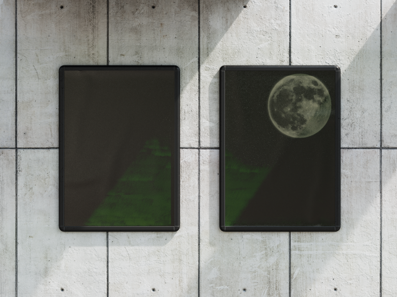
Corresponding designs are designs which are split between two or more picture frames but show different sectors of the chosen image. They often use elements such as symmetry, repetition and alignment which helps the designs look more visually appealing by making the design feel more balanced. They are considered effect in design because they reflect balance and cohesion making the final outcome both aesthetically pleasing and functionally effective. In my design, I made a tranquil nighttime landscape with a large hill and a large moon on each side, I did this because it leaves less empty/unused space when it is put into the two separate portraits. To create this, first, I used the paint bucket tool to make the background black and then i used the paint brush tool to create the stars in the night sky. To make sure the stars the right size and not too big or small I adjusted the point size to the one I felt was the most suitable for the image. As for the hills, I used the lasso tool to create them and the paint bucket tool to give them colour. I chose to use different shades of green on each hills as it further adds to the layering of the image and makes it look more three dimensional. To add the grass, I downloaded a grass brush from brusheezy and adjusted the size of it and then added it on the hills to give it a more realistic look. Finally, I also downloaded the moon brush from brusheezy and adjusted the size so it fit the image. The limited colour palette (mostly shades of black and green) evokes a sense of calmness and mysteriousness and emphasizes the natural beauty and the elements of the moonlit scene. The arrangement of the elements, with the dark hill leading into the open sky, combined with the soft tones creates a visually soothing image that captures the serenity of a night in nature. However, to critique it, I overdid the grass so therefore i would remove a lot of the grass as it makes it hard to see the layering of the hills and how there is multiple different ones as in the image it only looks like one hill. To show what it would like when finished, I added it into a mockup which presented it well although the shadow on the mockup makes it hard to see what it is.
USING SHAPES IN DESIGN
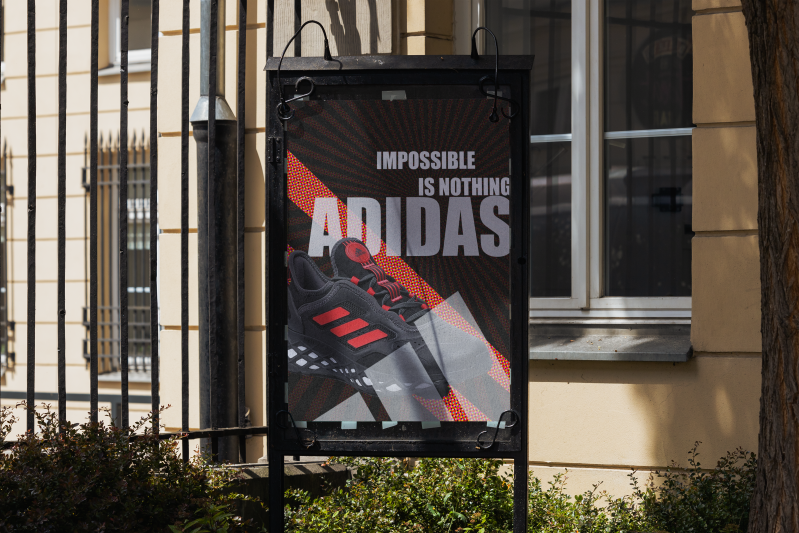
For the advert, we were told to include shapes in design. Therefore, I chose to do Adidas as they very commonly use vertical lines, for example their logo includes two slanted vertical lines within it. After finding the shoe I wanted to advertise, I chose the same red, black and white colour scheme as shown on the shoe because it made the shoe fit within the design and match. The colours show to viewer that the shoe and Adidas is courageous, clean and important. This is because red signifies courage, white signifies cleanliness and black signifies importance. After inputting the shoe into the design, I decided to put 2 vertical, red lines slanted behind the shoe. Furthermore, I added an effect to the them to make them and the shoe stand out more and appear more eye-catching. These lines, added depth and creativity to the design as it reduces the black space. Following this, I decided to add the text, which i chose to do in white as it stands out more on the black and red background but still fits with the colours of the shoe and the rest of the design. For the font, I chose a sans-serif font as it fits the target audience of teenagers as it presents the shoe as trendy and fashionable. Additionally, I chose to add the Adidas logo to further add layering and immediately show to viewer which company is advertising shoe. The is important as Adidas is a popular brand which means it is trendy and fashionable to wear their shoes and will mean the target audience will want to wear the shoes more. However, after completing all of that, the design still felt empty as there was lots of unused and black space which could deter certain people. Therefore, I added red vertical line streaks across the design around the text. This gives the design the extra creativity and makes it look less bland and boring; I also lower the opacity and placed it underneath everything else as full opacity would have been to overwhelming and make the design look too complicated and chaotic which will deter audiences. Finally, I added it into a mockup as it shows what the advert would look and how the public will view the advert.

VISUAL HIERARCHY
A visual hierarchy is the way elements are set out in order to show their importance, for example the more important things will be more central and bigger whereas less important things might be placed in less central areas and made smaller as they are not the focus of the product. Digital creators need to be aware of it because it can show to viewers the importance of certain things and help to remember certain elements within a design.

This film poster for Tenet uses visual hierarchy to immediately present the title of the film to reader. To do this, they made the point size of the text big and positioned it in the middle of the poster. Then, the viewers eyes are drawn the main image of the poster which attempts to hook the viewer into watching the film as it is bold and creative image. Within the main image, the directors name stands out as it is a bold font and white on black which means it stands out. This could be because the director has a good reputation and the marketing team want it to be known that he is directing the film as people which be more excited to watch a film that has a well established director. The next most prominent features that the eye is drawn to is the actors names and the date the film releases. This helps the poster convey the important information better and helps the viewer remember it better swell. The final feature of the poster is the block of writing in a non bold font which suggests that the information here is less important and doesn't need to draw the attention of the viewer.
For my design, I decided to make a film cover for the film "interstellar". Interstellar is film about space exploration so to show this, I used brusheezy to download a star brush to create the galaxy effect with a silhouette of a mountain. For the sky, I used a very slight lighter shade of black so that the mountains stood out more; to create the mountains I used the lasso tool. As I wanted the title to stand out the most, I made it the biggest and boldest thing on the poster as people will associate the big text with importance. Furthermore, the text I chose is sans-serif font which means the younger audiences will be more likely to like it and be interested in the film, this is important as the film is rated 12+. To make the design stand out more, I overlayed the mountains over the text as it provides a creative way to encompass the text within the design and build mystery into it. Additionally, as Matthew McConaughey is a very popular and famous actor I put his name in the top left as research shows that it is the first place look.

CARBON LITERACY

For my sustainable advert, I used visual hierarchy to make the important text the biggest as it conveys the information better and allows the viewer to focus on the important information and not be off put by blocks of text. To make the text look more intriguing, I made fade into the tree a little bit. To do this, I duplicated the layer and removed everything apart from the tree so that the text could slightly be in the tree. This adds mystery to the design and makes it appeal to younger audiences more. For the text, I used a sans-serif font and used the orange and yellow colours from the tree as it makes the design look far better if the text and image both present the warm colour scheme. The warm colour scheme presents to viewers that the improvements are beneficial and will better the environmental status of Barnsley and highlights the summery feeling the picture suggests.
CHRISTMAS CARD TASK

For the Christmas card, I decided to create the Ribblehead Viaduct in a snowy scene ,which is an iconic landmark in Yorkshire which has been used to shoot scenes in movies such as Harry Potter. I chose to do this as it embodies a Yorkshire Christmas to other people across the country and the world as it is a famous landmark. To do this, I used illustrator as I felt the animated look fit the card better rather than a realistic one. This is because it presents the card more simplistic which is a very modern design technique. For the hills, I chose to do different shades of white to give it the look of layering and so that you could see it was multiple hills instead of one. To make the bridge look three dimensional, I used darker shades of grey to show the shade so that it makes the card look more three dimensional and presents the card in a better way. For the sky, I used the paint tool to make it light blue and again used it to create the snow falling down effect. I felt that a lighter sky colour would work better than a darker blue because (even people usually associated Santa with the night) the lighter look uses a bright colour scheme which presents to the viewer a more merry and jolly feel which is what Christmas embodies. For the text font, I used Trajan Color. I used this font as gold is a colour often represented with generosity and giving which is another key value Christmas embodies. Furthermore, the font is a serif font which means it appeals to older audiences and keeps alive the traditional Christmas.
EVALUATION
Unit one as whole teaches us the basics of digital design and focuses upon the fundamentals that are vital for becoming a successful designer in the industry. The aim of this unit, is to teach us how to operate the software (such as Photoshop) efficiently and all of the tips and tricks of design. For example, I have been taught how use Photoshop tools such as the liquify tool, type mask tool, slicing tool and more. Learning how to properly use the software is essential to digital design because it removes the limitations meaning that you can actually create all of the ideas you think of. However, without the proper knowledge of the software and without the proper technical skills you cannot create the design you imagined efficiently. This allows you to plan more accurately and means overall you get a better result upon finishing creating. Furthermore, unit one also focuses heavily upon design theories, especially colour theory, shape theory and typeface theory. Theories are vastly important to design because they highlight the best ways to create your design and target the right audience correctly. Without learning the theories, you can send the wrong impression in your designs because you may use certain features that appeal to the wrong audience rather than the audience you were intending to market to. Colour theory, specifically, teaches us how different colours can evoke different emotions and how each colour has it own feeling embedded in the way they have been used. For example, bright colours can convey happy and jolly emotions whereas dark colours can convey dull and sad emotions. In typeface theory, it is shown how different fonts can evoke different feelings and how different point sizes of text can effect the importance of something - linking to visual hierarchy. Visual hierarchy is the way everything is positioned in a design to show importance. If something is more important, its more likely to be positioned centrally and large whereas something not important is more likely to be positioned to the side and smaller. However, the font of the text also matters a lot because if the font is sans-serif then it targets a different audience than a serif font, which shows the importance of carefully researching and picking the correct font style for the correct target audience. Shape theory focuses on shapes and how different shapes convey different things and give thing different implications. Overall, it teaches us how to encompass all of these theories and skills and combine them all together to make the best design possible.
To display these skills and theories, I created designs which highlighted the skills and theories within them. To display the liquify tool, I created a advert for a aquarium called "The Deep". Since it was an aquarium, I decided to use the liquify tool to give the text a wavy effect linking the text to the company more and making the advert more eye-catching. For the long shadow tool, I made a poster promoting barnsley college to year eleven students who will be starting college next year. To make this as eye-catching and memorable as possible, I used the colours red, white and grey linking to colours of the local football team and of the logo of barnsley college. This will make the design resonate more with the students and especially targets the local students who have grown up near and around the football team. As for typing around a path, I designed a logo for a clothing company called "Vault 66". I created the logo so that the name of the company circled around a vault. This makes the design stand out much more as the circled text is a more stimulating way to set it out. To display colour theory in a design, I made an advert for a new Nike shoe targeted at teenagers. As the shoe was all black and grey I also decided to make the advert that way as it helped the advert fit together and match better. Also, to accurately entice the target audience the shoe needs to seem cool and trendy as that is very important to teenagers. Therefore, through the use of a dark colour scheme the advert properly targets the correct audience whilst also still looking appealing and matching the product being advertised. To display typeface theory, I made a poster for a Halloween party. In the poster, the text is made the most important part of the advert by the rest of the design which lead the viewer directly to the text. Therefore, the text needs to be appealing and help get people to go to the party. To do this, I downloaded a Halloween font from Dafont. The font visualized Halloween with custom decorated letters which highlight the spooky theme whilst still being bold and eye-catching. To display shape theory in a design, I made another shoe advert but for Adidas this time. I chose Adidas as they are very heavily associated with the three slanted lines. So, to enforce this, I added slanted lines throughout the whole design and made it unavoidable to miss them. I did this as vertical lines signify strength and a sports brand like Adidas will want to put out the message that wearing their shoes gives you strength. In unit one, I have developed many skills which I was completely unfamiliar with previous to it; I have learned many Photoshop key skills and have learned a lot of the tools and other fundamentals of Photoshop like the formats which everything needs to be in. From having no experience, I can now confidently use the basic features of Photoshop. In unit one, my two biggest strengths are colour theory and typeface theory. For colour theory, I believe it is one of my bigger strengths because of all the research I have conducted into when doing research for both adding to my work and creating designs. This research has helped me gain more knowledge on key individuals and more in depth knowledge of the history of colour theory and the emotions each colour shows. For typeface theory, I believe it is strength of mine because it is fairly simple to introduce within design and because I conducted a lot of research into them, I understand kerning, tracking and leading well. On the other hand, my two biggest weaknesses are shape theory and corresponding designs. I believe shape theory is one of my bigger weaknesses as I very commonly get the three types of shape mixed up (abstract, geometric and organic). Furthermore, I also struggle incorporating abstract and organic shapes into design as I struggle to create designs where they dont look out of place or messy. Although, I think that with more practice and gaining more experience I will be able to easily remember the types of shape and overtime, be able to make good design which include abstract and organic shapes. Additionally, I believe corresponding designs could use more work aswell because I could not get manage to split the design exactly in half. To overcome this, I will just need to practice more corresponding designs and in time I will figure out how to perfectly split the two images. Throughout unit one, the British Values have been some vital values that I have to work by to make sure that the work done is the best it can be. The five British values are mutual respect, individual liberty, the rule of law, tolerance and democracy. Individual liberty is the right to make our own choice, so within unit one I have done this value in many aspects as the choice the create every design the way it is was my own choice. Mutual respect is treating people how you want to be treated; within this unit, there has been multiple group projects where respecting the people that you are working with is vital because without the respect then the group would crumble and the project would not work. Tolerance is learning about different culture and faiths, which again in the unit by meeting new people and creating designs on new things I have also done. The rule of law is understanding rules and why they are important, this done by the college lanyard and listening to the teacher when they are speaking. Finally, democracy is making decisions together, which through group discussions and projects is something that I have done. In terms of confidence in my work, I would say that I am far more confident in my theoretical work rather than my practical work. This is because, I worked for much longer on justifying everything and worked a lot on researching into everything necessary. Additionally, I already knew how to research effectively before this course but on the other hand I did not know any Photoshop skills before this course. And although they can improve, at the moment I feel that the theoretical work is of a better quality than my practical work currently. In this unit, I have learnt some soft skills. One of these include communication with others. In this unit, this skill has been strengthen through group projects as it requires good communication for two designers to collaborate and combine their ideas into one idea which works for both of them.
The skills taught in this unit are not only skills that are needed for this unit but they are also needed for every unit and for jobs in the real world after the course has ended. For example, all of the Photoshop skills will be used and developed upon in all of the remaining unit and if I get job where Photoshop needs to be used. Additionally, combined with the knowledge of all the theories that I have gained it will make creating design far easier as I will already have the knowledge and kills that are required unlike this unit where I am learning it for the first time. Now, I am far more confident in being able to incorporate all the theories into my work, which will mean I can up level my work from this in the next units. Overall, I feel unit one has taught me how and why digital designers create things the way they do which will help me when i'm creating designs.