
UNIT 3&4
OVERVIEW
Unit 4 focuses on how designs influence people through different theories and rules, it teaches us how to effectively include influential aspects in our designs. This helps designs be able to convey certain emotions or messages better as it looks at perceptions within society and beliefs amongst demographics which help convince into something. Furthermore, it also helps provides us with the skills to insert the idea into a persons mind, which additionally motivates someone into believing or wanting something which helps in make a promotional design work better.
RECEPTION THEORY
Reception theory is an approach to literary and media studies that emphasizes the role the reader or audience in interpreting and giving meaning to text. Reception theory shows that meaning is not hidden within in a text by the creator but is also made by the viewer themselves, which challenges more traditional views because it suggests that individual interpretation is valid. Readers interpretations are formed from many different things different for each people; for example: where they live, era and the society that they live in. However due to this, different viewers can form different interpretations which can have varied effects on an authors work.
COCA COLA LOVE CAMPAIGN
This Coca Cola campaign, focused on promoting LGBTQ+ love and supporting people who apart of it. To do this, Coca Cola connected their company with LGBTQ+ by using the cursive serif font on the front of their cans and put two next to each other to create the word "love". This helps people who are LGBTQ+ feel appreciated by Coca Cola and presents the brand as more welcoming place for LGBTQ+ people. Therefore, the campaign intends to target the LGBTQ+ audience and make them want to drink coke and associate with them as it helps express their personality. Additionally, the LGBTQ+ flag inside the 'O' further provides support for the community and makes it clear that the purpose of the campaign is to promote love for the LQBTQ+ community as many people as still unwilling to accept it in the modern era.

COCA COLA DREAMWORLD

The advert for the Coca Cola drink creates a sense of mystery and intrigue into the drink as it includes strange and unusual things in the background which force the viewer to contemplate what the flavour of the drink actually is. This is intentional as the whole purpose of the drink to get people to buy it from curiosity alone - possibly suggesting the flavour is unpopular/ not nice. This would mean that the drink would not sell anyway and making it a drink of mystery is bound to get more people interested in the drink which will mean there will be more sales. However, the intrigue from the advert and other campaigns would potentially mean people wouldn't even consider that and just want the drink from intrigue alone.
SEMIOTICS

Semiotics the study of signs and symbols, their meanings and how they communicate messages within various contexts. Semiotics explore how things are interpreted through different signs, images, text, colours and more. Semiotics are used because it allows for the removal of words and allows for viewers to process the meaning of an advert through symbols and makes an advert stand out more and look more creative and helps the idea of the advert resonate with them for longer. In my design, I used the symbol of a gun (a symbol that is known all around the world as a symbol of death and tragedy and used Photoshop to make keys look like this symbol of a gun. What this does, is makes viewers associated car keys and driving with those negative connotations and allows them to think about how safely they drive which is the purpose of the advert. The statistic of 1695 a year car related deaths reinforces the fact that driving is very dangerous and makes viewers think if they are driving safely on the roads and taking the necessary precautions needed. Furthermore, the basic black background shows to viewers that it is an important topic which needs to be taken seriously instead of them taking one glance and never thinking about it again.
TRADITIONAL USES & GRATIFICATION
●What is Uses and Gratification Theory?
Uses and Gratification Theory is a theory which explores why people consume media for their different needs. The needs typically being: education, entertainment, social interaction, personal identity and escapism.
●How would you use the theory in your designs?
One way I could use the theory in my designs, is by conducting research to understand the specific needs of the target audience. Furthermore, I could also use it for testing, as it can show how well your creates appeal to your target audience and by gathering feedback you could improve the design to look nicer to the audience.
●How confident are you using Uses and Gratification theory in the future?
Fairly confident
●What is Reception Theory?
Reception Theory focuses on how audiences interpret different concepts in media from their personal background and factors such as: culture, religion, age and gender. It is especially useful in deciding how to design an effective design for you target audience.
●How would you use Reception theory in your designs?
Reception theory in design focuses on how users interpret visuals based on their background and personality. Therefore, with research into the target audience and using reception theory it makes it easier to make an effective design for the target audience.
●How confident do you feel about using Reception theory in the future?
Not very confident
●Of the 4 theories we’ve covered so far, Representation, Semiotics, Reception & Uses and Gratifications – which do you think is the most important and why?
In my opinion, uses & gratifications theory is the most important as it shows how people interpret different medias.
ALBUM COVER

I have created a album cover for Kendrick Lamar to do this I went on Photoshop and used the paste tool to paste all the images in and I used the magic wand and quick selection tool to remove the background on the artists image. Then, I added a filter to background to make everything stand out more, especially the text which I used a bold sans-serif font to catch the attention of younger audiences. I created it this way because the colours actually represent the artist as typically these colours would not be seen together although they work well together which links to Kendrick as each song is different and includes different genres and styles which work well together like the colours. The sunset imagery can symbolize life and his upbringing - common themes in Kendrick Lamar's music, where he often explores complex themes like his upbringing and growth. The grainy texture gives the cover a retro, nostalgic feel. It adds depth, as if the image is part of a larger story or history, which aligns well with Kendrick's storytelling approach in his lyrics.
REFLECTIVE WRITING PIECE
Over the last 5 weeks. we have created many different designs for many different things such as: adverts, logos, album covers, etc. Furthermore, we have researched into many different theories and rules within the digital design world such as colour theory, typography, uses & gratification theory, etc. Due to this, we were able to incorporate these theories into our designs. For actually creating the design, I found it very enjoyable and fun to create it. However, researching and documenting about the design felt very boring and time consuming as I do not enjoy writing long bodies of text. In my opinion, I found that my best work was in unit 2&5 where we promote companies and make logos for them. Coincidentally, this is also the work the most enjoyable as it was the units that required the most practical work. However, my work in unit one could be better but personally I find it harder than the other units. I find this the hardest because it is less practical work and delves more into the reasoning of everything and into different theories and rules within digital design, which I find less fun compared to the other units where it is more practical work. If I could, I have would have changed my design for the album cover and for the Halloween poster as I do not like how they turned out. I would change the whole Halloween poster as I do not like it at all and for the album cover, I would change the background as it doesn’t fit this type of music correctly in my opinion. Next time, I would research more into how these different things look as I did not really research and just went through with it without any inspiration.

The IKEA advert combines vibrant colours and product promotion, using the image of a red and white duvet cover arranged to make an ice cream. This evokes the feeling of summer in the viewer and aligns with the "New summer collection" message, which alongside the price makes the advert very tempting to a viewer. The imagery is intended to catch attention, as it uses the positive associations of ice cream to draw in viewers. On the other hand, whilst the ice cream is engaging and creates a connection between the product and summer emotions, it could possibly present the wrong idea to the viewer as an ice cream and a duvet have no connection at all, provide something that could potentially be confusing to viewers. It could require some time to connect the image to the product, which might deter some audiences. Overall, the ad succeeds in creating curiosity and presents a sense of lighthearted fun. However, its abstractness could stop some audiences from interacting with the advert.
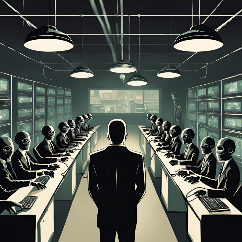
HYPODERMIC NEEDLE
Hypodermic needle theory is the theory that the media and important people have a lot of influence on audiences as if it is the knowledge gets injected into them by a needle. It is a commonly used tactic by media outlets who try to push an important message out which people need to know about. It also tried to be used by the government during elections to try help a person vote for the candidate that they are advertising. This method is incredibly useful in convincing someone to believe something as the influence of someone helps make something more believable and helps gets a viewer to do something.
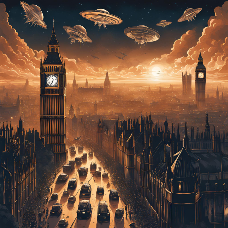
FAKE NEWS STORY

10 POTENTIAL ASSETS FOR USE IN THE VIDEO


The video
For this task, we were told to create a fake news story using Adobe Premiere Pro to develop our technical video editing skills and improve our understandings of the different theories and skills of video editing. This helps make us gain more knowledge on what makes a good video and how to successfully produce effective videos to work in the industry. For my fake news story, I chose the idea of the government being controlled by aliens as it is an exciting and engaging topic yet obviously false. As this was my first time using the software, the quality of editing could definitely be better and higher quality. Overall, I feel the video could be better made. To make it, I included an engaging copyright free audio with an AI voice overlaying the video and sound to imitate a news reporter. I also included copyright free clips and a Photoshoped image. However, I feel the video is not very good and with more time, I would definitely be able to make improvements. This is because the clips just feel unnatural and out of place; additionally, the Photoshoped image does not fit in either. On the other hand, I believe the audio is alright and is probably let down by it visual elements. Next time, I will spend more time gathering clips and spend more time planning and with improved skills I believe I could create something of far better quality.

MODERNISM AND ART DECO
"Art Deco focuses on bold, luxurious elements, while Modernism values simplicity and functionality. Art Deco embraces geometric patterns and ornamentation, whereas Modernism favors clean lines and minimalism. Art Deco uses vibrant, bold colors, while Modernism sticks to neutral palettes with natural materials" (https://www.eurolinesteelwindows.com).
Art Nouveau
Art Nouveau is an artistic movement that started in the 19th century and is characterized by its use of long, organic lines. Previously, It was used ,mostly in things like jewelry , architecture and posters. However, after World War I starting being more frequently used in industrial society. At the same time, the first digital design courses were launched, a key moment in the transition to digital design in advertising.
Cubism
Cubism was a revolutionary approach to represent reality invented around 1907 by Pablo Picasso. In cubism, objects are broken up and rearranged in an abstract form so the image appears abstract and fragmented. Picasso was highly inspired by African tribal masks which are very unnatural yet still present a vivid human image.
Futurism
Futurism is an Italian art movement invented in 1909 by the poet Filippo Tommaso Marinetti. Futurism focuses on the technical progress of the modern machine age, dynamism, speed, energy, vitality and change. According to Oxford dictionary, futurism is a movement which strongly rejected traditional forms and embraced the energy and dynamism of modern technology. It had effectively ended by 1918 but was widely influential, particularly in Russia on figures such as Malevich and Tchaikovsky.
Expressionism
Expressionism refers to art where the image of reality is distorted in order to make it expressive of the artists feelings or ideas. In 1905, the movement emerged when a group of four German students founded the bridge group in the city of Dresden to recognize the birth of expressionism. it uses vivid colours and bold strokes to exaggerate emotions and feelings.
Dadaism
Dadaism was a movement with clear political overtones, a reaction to the slaughter of World War I. The Dada movement stared in the 1910s in Zurich. It was invented by refugee artists and intellectuals from European capitals of countries involved in World War I. Dada artists are known for their use of everyday objects and presenting them as art with little altering by the artist.
Constructivism
Constructivism in an early 20th century art movement, founded by Vladimir Tatlin in 1915. Constructivist art used abstractness to reflect modern industrial society and urban space. The movement didn't follow the conventional decorative styling to favour industrial assemblage. Often, the art is soulless and without emotion as it is very geometric and fairly experimental.

For my design, I decided to first pick the art style that I was going to do and landed on constructivism. Therefore, I started thinking about what films would work with this art style and realized the similarities between the style and the film Fight Club. I decided to take a scene from the very end of the film as I believe it the most engaging part of the movie and also reflects modern society and shows an urban space. To create it, I opened Adobe Illustrator and used the pen tool to trace over all of the different buildings and scenery from the shot. Then, instead of making it realistic, I made everything block colours, this reflects constructivism and links to other typical designs using the style. Furthermore, the silhouetted figures suggest tension and the minimal detail adds mystery and leaves it up to the viewer to decide the theme of the movie. The colour scheme of mostly blacks and blues, create a eerie and gloomy atmosphere which will further build the suspense. The layout being all symmetrical and geometric, dont follow the conventional decorative industrial styling, increasing the posters link to constructivism. Finally, to include the title of the film I wanted to include a popular and widely known phrase from the film - the phrase being "the first of Fight Club is dont talk about fight club. The bold fonts of the text draws the attention to the text and presents a more interesting look to younger audiences as they tend to prefer sans-serif fonts. Additionally to the text font, I added the triangles at the top which present the rigidness of constructivism and highlight the text on a dark background.
MID-CENTURY MODERNISM
Post War Propaganda
Posters played a crucial part in communication during world War II, sharing its spotlight with radio and print. At this time, papers were printed using the technique of photo offset, resulting in the famous dot pattern seen in newspapers and magazines. During World War Ii, designs were mostly propaganda posters trying to convince people to join in the war.
50s Hyper Colour
The 50s introduced a different trend from others in history. The designs introduced were a mixture of many things such as love, sex and glamour. Posters created using 50s style used vivid colours and playful motifs to appeal to a wide audience. Artists like Herbert Leupin in Switzerland and Paul Rand in the United States are some of the styles' most famous users.
Swiss-Style Simplicity
Swiss style is a design movement from Switzerland in the 1950s and is known for its emphasis on simplicity and minimalism. The simplicity of the style also commonly had humorous undertones which helped in corporate identity and expression. It usually included making everyday objects into giant icons, which emphasized the meaning of overlooked things.
As we had to the same film for each era of design, for mid-century modernism I chose to Swiss-style simplicity. I chose this, as I think the mid-century modernism design era doesn't really line up with the film; however, Fight Club is a very popular and iconic film so I thought it was best to do Swiss-style as the the bar of soap is a highlight of the film and can be used in Swiss-style. Furthermore, the soap also builds the interest and makes the reader begin to question why the bar of soap and what significance it has to the film. To create it, I used the lasso tool to draw the bar and added the pinks using the paint bucket tool - making sure to have a darker shade of pink to give the three-dimensional look. The design is obviously very simple which links to Swiss-style and if you watch the movie, the soap being presented in this lighthearted and unserious way presents the humorous tones. For the "fight club" text I used a bold font to draw attention to the poster and added the darker pink underneath it to highlight the text even further. Additionally, I slightly off put each letter to give the text the unstructured and informal design with letters being different distances from each other. This further adds lightheartedness and therefore humour to the poster which works for a Swiss style design. As for the cast and director, I took inspiration from other Swiss-style designs which didn't include capitals and a basic font, this enforces the minimalist approach and simply yet effectively includes the information needed in the poster. For the background, I chose green as in many posters for the film green pink are seen together and having them in this poster helps film recognition and immediately presents to viewers the what the film is. As the film is targeted at teenagers, I added a few splashes of green in the background and used the mixer brush tool to give it that effect. This allows for the design to stand out more to target audience whilst still keeping the simple design of Swiss style.

AGE OF REBELLION
Surrealism
Surrealism was a cultural movement which developed in Europe after the event of World War I and was heavily influenced by Dada. The movement is best known for its visual artworks and how it activates the unconscious mind through the unusual and commonly out of place imagery.
Pop Art
Pop art is an art movement which started in the United States and United Kingdom during the 1950s. The movement challenged the traditions of art by including imagery from popular culture such as advertising and comic books. It usually involved the manipulation of colours and used irrelevant colours to the subject to highlight an aspect of it.
Psychedelic
The Psychedelic movement of the 1960s, was not only seen in the popular music but also was viewed in many aspects of popular culture such as fashion, language, art and literature. Visuals during this time included curved shapes and barely legible writing inspired by Art Nouveau and intense colours inspired by the Pop Art movement.

For Age of Rebellion, surrealism linked very well with the film and the two had many similar qualities between them. However, I was not confident enough in my Photoshop abilities to create a surrealism design as it is very complicated and time consuming and things like Pop art is much easier. Therefore, I went with Pop art. I started with the background, where I came to the conclusion that the best colour for it would be red because Pop art involves using irrelevant colours and challenge the original preconceptions about something and red, out of all the colours, has the least relevance to the film. Therefore, I used the polygonal lasso tool to create triangles and used the paint bucket tool to make each one a different shade of red. This highlights the poster by challenging the traditional art norms. Then, I copied the image over and used the magic wand tool to remove the background of the picture so it was just Brad Pitt. Next, I used the the magic wand tool (to select different areas of the image), the eyedropper tool (to get the colour from the area) and finally, the paint bucket tool (to fill the highlighted areas in one block colour from the selected area). This presents the image in a painted way rather than a realistic image. This fits more with other types of Pop art designs whilst also standing out from non-Pop art designs, which is perfect as it gets the best from both worlds. To finish off the design, I altered the brightness and contrast. I decreased the contrast and increased the brightness, which makes the background colours more intense and eye-catching whilst also darkening the image. This is a significant part of Pop art as in Pop Art the colours play a more important part than the actual image. Therefore, it is important the colours stand out and are as intense as possible to compliment and the image and challenge the average colours associated with it.
MATRIX VIDEO
EVALUATION
Within Unit 3+4, we have covered the way different theories and designs influence people through different colours, fonts, shapes and mediums. Furthermore, we have also analyzed popular designs and assessed how effective the designs have been to convey the what the advert was trying to convey. With the theories and skills we have used in this unit, we can carry those skills through into our designs and our justifications to make them as good as possible. Unlike other units, Unit 3+4 has also crossed into the realm of video editing and taught us the basics of video editing on Adobe Premiere Pro and taught the skills needed to be able to effectively edit videos to make high quality video advertisements. Finally, Unit 3+4 covered the growth of advertising and has gone in depth to show us how advertising has developed throughout the years. Learning about the history of advertisement, helps to understand how different things influence different people during different times and use that within your own designs. Additionally, it also allows you to see failed design techniques and shows you why it failed in order for us to not repeat the same mistakes and understand patterns. Overall, the skills from this unit are very transferable across the industry and past college, especially in social media marketing as it focuses on how to influence someone and also video editing.
Our first creation of the unit was a semiotic. A semiotic the way different symbols convey different things and the way people interpret things. Semiotics are particularly useful in marketing as they are perfect for influencing customer emotions and perceptions by metaphorically using a symbol to represent a bigger picture. Therefore, for my semiotic I decided to make one about reckless driving and positioned some car keys to make a gun symbol insinuating death which to viewer links unsafe driving to those negative emotions of death and pain that the gun conveys. Then, we created an album cover using the reception theory skills we learned. Reception theory looks into how people interpret media and how the meaning of a design isn't made by the creator but by the viewers. Therefore, for my album cover, I used Kendrick Lamar who likes to include lots of metaphorical lyrics in his songs and use multiple meanings through media and shows. I included a sunrise in the background of the album cover which allows viewers to create their own perceptions into what it means as overall the album is left fairly ambiguous which allows for viewers own interpretations. Then, we moved onto video editing where we were tasked with making a fake news story. With the skills taught, I created the video with an engaging audio over it and a AI voice explaining the topic in order to make it exciting to the viewer. Finally, we used art styles from history to create a poster for a movie in three different styles from three different eras. This helped develop our understanding of how trends emerged and gives more variety and allows more difference within our work. Two strengths from this unit would be semiotics and reception theory as from everything we have learnt about in unit 3+4, those are the two things I understand the most and the two designs using these skills are better than my other creations using other skills in my opinion. However, two weaknesses from this unit would have to video editing and Swiss-style. For video editing, I might be more confident now but working with Premiere Pro for the first time, I found it very hard and complicated which meant the fake news story could definitely be edited better. For Swiss-style, the design I made for Fight Club didn't fully show the full extent of Swiss-style and maybe could be created better. In this unit, we have used lots of different British Values to adequately work together and learn together as a class and individually, in order to make the best designs possible. Mutual respect and tolerance have both been used within group discussions and group projects so that everyone works well together and get along with each other. In these group discussions, democracy is shown as everyone has a say and is allowed to get their point across. The rule of law was shown through people showing up on time and respecting and listening to the teacher. The final British Value, individual liberty was used in creation as everyone creates their own project and are encouraged to create it how they feel looks good - not based on other peoples views. Overall, I am fairly confident is good enough for a pass level as for every design I have included the skill that the task was based upon and also included an in depth justification showing why and how I produced it. However, I believe the video could be much better and maybe if I had more time I would remake it. Additionally, Unit 3+4 has taught us many soft skills, some of them being: problem solving, creativity and persuasion. Problem solving was mostly used in the Matrix video task, where we had fix a video clip with the clips being mixed up and scrambled. Problem solving was used here by repairing the video and being resilient despite the challenging task. Creativity and persuasion were employed during production as we had to creatively design a semiotic whilst keeping the persuasion factor in it.
Overall, this unit has taught us transferable skills which have and will be very useful in different units, our FMP and also in jobs after college. Especially the persuasive techniques and the video editing will be used very frequently in social media marketing and in marketing where the goal is to convince someone to do something. Additionally, the soft skills we have learnt we be useful everywhere not just in the industry. Finally, in Unit 3+4, I believe I have done alright, I maybe could have done better but overall I am okay with how it came out.